Best Approaches for UI/UX Redesign in B2B SaaS: What Actually Works
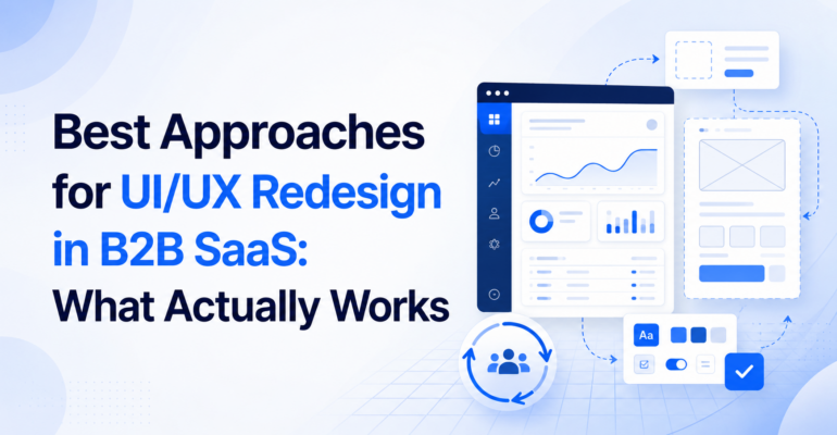
Best Approaches for UI/UX Redesign in B2B SaaS: What Actually Works
Most B2B SaaS redesigns fail quietly. Not because the visual design was bad, but because the team redesigned the wrong layer. They polished the surface while the structural problems sat untouched underneath. This guide documents what actually produces results, drawn from Brainium’s work across staffing platforms, logistics dashboards, coaching SaaS products, and compliance portals.
One engagement that crystallised these principles for us was Gymfluence, a B2B coaching platform built for the Nordic market, helping nutrition and fat-loss coaches manage multiple clients through a single behavioral intelligence interface. Brainium was engaged for UI/UX design only: no development, no backend. Pure product design from discovery to handoff.
What we learned maps directly onto the following principles.
Start with a User Journey Audit Before Opening Any Design Tool
The single most common mistake in SaaS redesign projects is beginning with wireframes. The instinct is understandable: there is a visual problem, so reach for a visual tool. But the visual problem is almost always a symptom of a structural one.
Before Brainium’s design team touched Figma on the Gymfluence engagement, we mapped three core user flows: how a coach onboards a new client, how a coach monitors active client progress, and how a coach interprets adherence drift signals. This mapping exercise revealed that the friction was not in any single screen, it was in the transitions between states. Users were being asked to hold context in their heads that the interface should have carried for them.
What to do: Build a journey map for your top 2-3 user tasks. Note every moment the user must remember something the system should be tracking. Those are your redesign priorities.
Separate Information Architecture from Visual Design in Sprint One
These are two different disciplines and conflating them in the first sprint is the fastest path to a redesign that looks polished but still confuses users.
Information architecture answers: what content exists, how is it grouped, and what hierarchy should it follow? Visual design answers: how should that content feel and be styled?
On the Gymfluence project, the IA work identified that the platform was trying to serve two distinct user mental models, the coach managing a single client deeply, and the coach getting a portfolio-level overview across all clients, through the same navigation structure. These needed to be treated as separate modes, not squeezed into a single sidebar.
Resolving the IA before touching a color palette saved at least two rounds of revision.
What to do: Deliver an IA document as a standalone sprint-one artifact. Get stakeholder sign-off on it before any visual explorations begin.
Design the Admin Panel with the Same Rigour as the End-User Interface
In B2B SaaS, the admin panel is where the paying customer spends most of their time. In fitness coaching platforms, the coach is the paying customer, not the end member. Yet design budgets and attention almost always skew toward the member-facing interface, because that is what looks good in a demo.
On Gymfluence, the coach dashboard was the product’s core value delivery surface. It needed to communicate behavioral data, adherence patterns, progress signals, drift indicators, at a glance, without requiring the coach to drill into individual client records for every monitoring cycle. Getting this right required multiple rounds of information density testing: how much data can a coach usefully scan in a single view before cognitive load degrades decision quality?
What to do: Identify which user role generates the revenue. Design their primary workflow first, most carefully, and with the most iteration cycles.
Build a Component Library, Not Just Screens
Delivering static screens is designing for the handoff moment. Delivering a component library is designing for the product’s lifetime.
On every Brainium SaaS engagement, we deliver a structured Figma component set as part of the final output. For Gymfluence, this meant a reusable library covering data display cards, status indicators, progress visualisations, and navigation patterns. The development team received components they could build and extend, not screens they had to reverse-engineer into code.
This approach matters for AI-era products specifically: as SaaS platforms add AI-generated content and dynamic data surfaces, a rigid screen-based design breaks. A component library scales.
What to do: Insist that your design partner delivers components with documented states (default, hover, active, disabled, error) not just polished hero screens.
Validate Navigation Assumptions with the Actual User Cohort
Founders almost always have a different navigation model in their heads than the users who will actually use the product. This is not a criticism, it is a function of familiarity blindness. When you have lived with a product for two years, obvious navigation paths become invisible assumptions.
The Gymfluence client base is Nordic: coaches operating in Norway, Sweden, and adjacent markets. Their expectations around data privacy signalling, dashboard density, and where settings should live were measurably different from what a South Asian or North American product team would default to. Small but consequential differences in how trust is communicated visually, for instance, required calibration specific to that user cohort.
What to do: Before any final design decisions, run at least five task-based sessions with users from the actual target geography and role. Do not validate with your own team.
Use Visual Identity to Signal Product Category, Not Just Brand Preference
In B2B SaaS, the visual language of a product tells a sophisticated buyer what category the product belongs to and therefore what peer products it should be evaluated against.
Gymfluence needed a visual identity that signalled precision, behavioral science, and professional-grade tooling. Not a consumer fitness app aesthetic, which would have positioned it incorrectly against amateur market competition. The typography, color system, and component styling were all calibrated to communicate “serious coaching infrastructure” rather than “wellness brand.”
This is not a cosmetic choice. It directly affects how prospects evaluate price acceptability and integration with their professional identity.
What to do: Before setting your brand direction, identify three products your target users already trust and use professionally. Understand what visual signals trigger that trust. Design toward those signals, then differentiate.
Treat the Marketing Site and the Product as One Design System
The most common disconnect in SaaS companies, especially at seed and Series A stage, is a marketing site that promises one experience and a product that delivers another. Users notice this immediately on first login, and it degrades confidence in the product before they have had a chance to evaluate it.
Brainium’s Gymfluence engagement covered both the marketing site UI and the coach dashboard concept under the same visual system. The same type scale, the same color logic, the same spatial principles. When a coach clicks from the marketing page into the onboarding flow, the product feels like a continuation, not a jarring transition into a different product.
What to do: Treat your marketing site and product as one design system from day one. If they were built separately and diverged, that reconciliation is its own sprint and it is worth doing.
Frequently Asked Questions
1. How long does a B2B SaaS UI/UX redesign typically take?
A focused redesign engagement covering IA, UX flows, visual design, and component library typically runs 8 to 14 weeks for a product with 5 to 10 core screens. This varies significantly based on scope, stakeholder availability for review cycles, and whether development is concurrent.
2. What does a UX audit include for a SaaS product?
A thorough UX audit covers user journey mapping for top tasks, heuristic evaluation against established usability principles, information architecture review, navigation and wayfinding analysis, and identification of friction points in conversion and activation flows. Deliverables typically include a prioritised findings report and a redesign brief.
3. What is the difference between UI and UX in a SaaS product context?
UX (user experience) design addresses how a product works: the flows, logic, and information structure. UI (user interface) design addresses how it looks and feels: visual hierarchy, typography, color, spacing, and component styling. In practice, the strongest SaaS products develop both disciplines in parallel under the same design leadership.
4. When should a SaaS company invest in a full redesign versus iterative improvements?
A full redesign is warranted when the information architecture is fundamentally misaligned with how users think about the product, when the visual system cannot accommodate the product’s expanding feature set, or when user research reveals that surface-level improvements will not address the core friction. Iterative improvements work when the structure is sound and the problems are localised.
5. What should a SaaS company look for in a UI/UX design partner?
Look for a partner who audits before they design, delivers component libraries not just screens, works with your actual user cohort rather than assumptions, and can articulate why every design decision was made. Portfolio quality is necessary but not sufficient — the reasoning behind the work matters as much as the output.
Brainium Information Technologies is a custom software and AI engineering company headquartered in Kolkata, India with a UK presence. We work with mid-market and enterprise clients across healthcare, logistics, staffing, pharma, and SaaS.
Interested in a UX audit for your SaaS product? Talk to us